

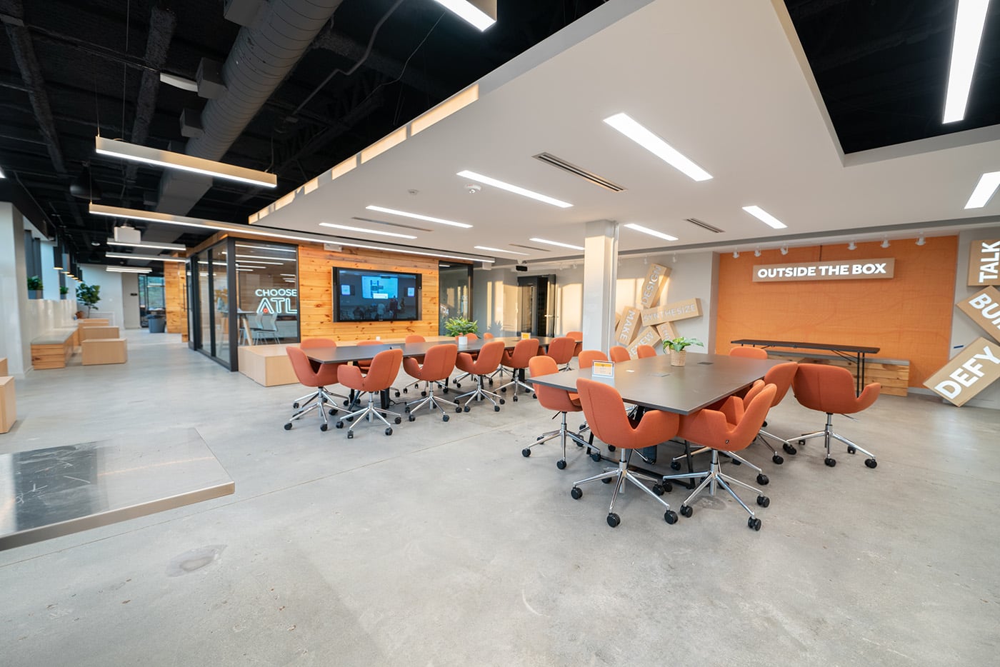
A reception area can feel welcoming, clinical, or dated before a visitor reaches the front desk. Employees notice their surroundings, too, especially when they spend much of the day in the same office. Wall colors contribute to those impressions alongside lighting, furniture, and layout.
For Atlanta businesses, a commercial paint color strategy gives those choices a clear purpose. The right palette should suit daily activities, reflect the organization’s identity, and feel comfortable to the people using the building. Choosing it requires attention to the space itself, rather than assumptions about what a particular color should accomplish.
What Shapes a Commercial Paint Color Strategy?
Color psychology considers the associations people make with different colors. Those responses vary with personal experience, culture, and context. A commercial paint color strategy works best when it accounts for these differences and the building’s practical requirements.
Muted blues and greens can provide an understated background, although they do not automatically improve concentration or reduce stress.
Warm colors can give shared spaces a lively appearance, particularly when used as accents rather than across every wall.
Neutrals help connect rooms with different functions, but their undertones need to work with existing flooring and furniture.
Strong contrast can draw attention to entrances or architectural features. Excessive contrast may make a busy space feel visually crowded.
A useful commercial paint color strategy considers these effects together. The amount of color, its placement, and the surrounding materials all influence the finished result.
Planning a Commercial Paint Color Strategy Around Daily Work
Offices and Focused Workspaces
Employees working at screens need a backdrop that feels comfortable throughout the day. A commercial paint color strategy for these areas often favors restrained shades that sit comfortably beside desks, monitors, and storage.
Lighting deserves close attention. A pale color may appear bright under overhead fixtures, while a darker shade can make a room feel enclosed. Testing larger samples helps reveal these effects before the entire office is painted.
Meeting Rooms and Shared Areas
A commercial paint color strategy can give meeting rooms a distinct appearance without disconnecting them from the rest of the workplace. Selected accent walls may add interest while keeping presentation areas visually simple.
Video meetings also affect color placement. A bold wall behind a speaker may compete with their appearance on camera. Break rooms offer different possibilities, since employees use them for meals, conversation, and a change of setting. A commercial paint color strategy should respond to those activities.
Connecting a Commercial Paint Color Strategy With Brand Identity
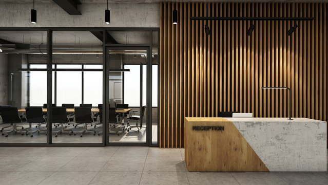
Making Reception Areas Feel Intentional
Brand colors can help visitors recognize a business, but a saturated logo shade may feel overwhelming across a large lobby. A commercial paint color strategy can introduce that color through a feature wall while using complementary neutrals elsewhere.
An Atlanta professional office may suit subtle contrasts and warmer finishes. A creative business may prefer a more expressive entrance. The decision should reflect the organization and its customers, rather than follow a trend that feels unrelated to either.
Giving Different Areas a Clear Identity
A commercial paint color strategy can distinguish departments, meeting rooms, or building sections. These visual cues are especially useful in properties with similar-looking corridors and repeated layouts.
Navigation still needs readable signs and room numbers. Color alone cannot serve every visitor’s needs. A commercial paint color strategy should complement clear labeling and provide enough contrast for important information to remain visible.
Checking a Commercial Paint Color Strategy Before Approval
Reviewing samples in the actual building gives decision-makers a stronger basis for approval. A commercial paint color strategy should be checked against the conditions occupants experience every day.
Lighting: Inspect larger samples under daylight and artificial lighting. Check morning and afternoon conditions where exposure changes noticeably.
Existing finishes: Place samples beside flooring, cabinetry, furniture, and doors. Undertones that clash may become obvious when materials are viewed together.
Paint sheen: Review color and sheen together. A commercial paint color strategy needs finishes suited to cleaning requirements and the appearance of the surface.
Occupant feedback: Ask employees about proposed colors in regularly used spaces. Their observations can identify concerns before work begins.
Consistency: Confirm that the commercial paint color strategy connects adjoining rooms and supports future maintenance or phased repainting.
Choose Socium Coatings: Your Trusted Partner for Commercial Paint Color Strategy in Atlanta
Plan the next workplace refresh with a commercial paint color strategy that suits the building and its occupants. Socium Coatings provides commercial painting, architectural coatings, and maintenance services, with experience dating back to 1999. Contact Socium Coatings to discuss the Atlanta property’s needs and request a quote for a workplace that feels considered, welcoming, and consistent with the business.








Leave A Comment