

A commercial building’s exterior is often the first impression customers, clients, employees, and business partners have of a company. The right paint colors can communicate professionalism, reinforce brand identity, and make a property look more modern and inviting. As businesses invest in their facilities, modern commercial building colors are becoming an important consideration in creating attractive, cohesive corporate spaces.
From sophisticated neutrals to bold architectural accents, today’s commercial color palettes offer plenty of opportunities to improve a building’s appearance without compromising its professional character. Choosing the right combination requires considering the building’s architecture, surrounding environment, and the image a company wants to project.
Why Commercial Building Paint Colors Matter
Creating a Professional First Impression
A building’s exterior contributes to how people perceive the business operating inside it. Clean, coordinated colors can make a property appear organized, established, and professionally maintained. Conversely, faded paint or mismatched color combinations can make even a well-maintained building look outdated.
Modern commercial building colors help businesses create a polished appearance that feels intentional. Whether it is an office complex, corporate headquarters, or commercial property, a carefully selected palette can make the building more welcoming while maintaining a professional image.
Reinforcing Corporate Brand Identity
Exterior paint can also complement a company’s existing branding. Businesses can incorporate brand colors through architectural details, entrance features, trim, or accent walls without overwhelming the entire facade.
For example, a company with a recognizable blue logo might use a neutral exterior with subtle blue accents. This approach creates a connection between the building and the brand while keeping the overall design sophisticated.
Modern Commercial Building Colors to Consider
Warm Neutrals for a Sophisticated Appearance
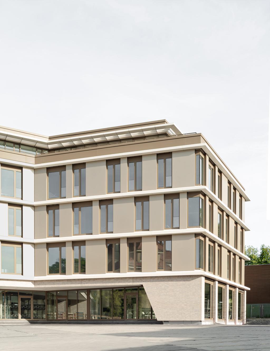
Warm neutrals such as beige, greige, taupe, and soft ivory are popular choices for contemporary commercial properties. These shades create a welcoming atmosphere while maintaining the understated appearance many corporate environments require.
Unlike stark white or cool gray, warmer neutrals can soften large exterior surfaces and complement materials such as stone, wood, concrete, and metal. They also offer flexibility when businesses want to update landscaping, signage, or architectural accents in the future.
For companies seeking modern commercial building colors that remain adaptable over time, warm neutrals provide a versatile foundation.
Charcoal and Deep Gray for Contemporary Architecture
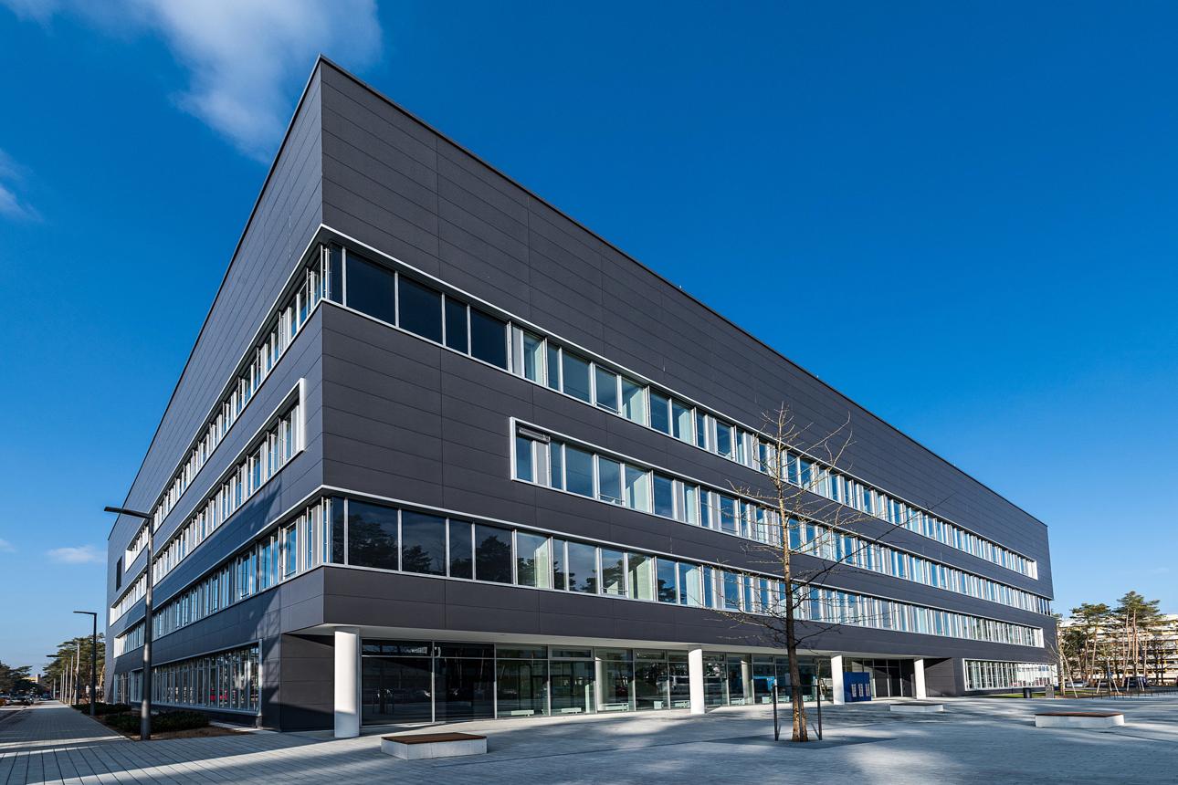
Charcoal, slate, and deep gray can give commercial buildings a distinctive contemporary appearance. These colors work particularly well with modern architectural features, including large windows, metal panels, geometric designs, and minimalist entrances.
Deep gray can create contrast around windows and entrances or serve as the primary exterior color when balanced with lighter architectural elements. Pairing charcoal with white, natural wood, or metallic finishes can help prevent the facade from appearing too dark.
For corporate headquarters and professional office buildings, these modern commercial building colors can establish a strong visual identity without relying on excessive decoration.
Earthy Greens and Natural Tones
Earth-inspired colors are another option for businesses looking to create a more natural, approachable exterior. Muted sage, olive, soft moss, and other subdued greens can complement landscaping and help commercial buildings blend into their surroundings.
These shades are particularly suitable for properties with extensive outdoor areas, natural materials, or architecture designed to connect indoor and outdoor spaces. When combined with warm neutrals and wood-look finishes, earthy tones can create a balanced and contemporary appearance.
The key is choosing muted shades that maintain a professional look rather than overly saturated colors that dominate the facade.
How to Combine Colors for a Cohesive Exterior
Use a Primary Color and Complementary Accents
A successful commercial palette usually starts with one dominant exterior color, supported by complementary secondary shades and carefully placed accents. The primary color establishes the building’s overall appearance, while secondary colors help define architectural features.
For example, a light gray facade could be paired with charcoal trim and a muted brand-color accent around the entrance. This creates visual interest without making the building feel overly busy.
Modern commercial building colors are most effective when each shade has a clear purpose within the overall design.
Consider Architectural Features and Materials
The building’s existing materials should influence the paint selection. Brick, stone, glass, metal, and concrete all interact differently with surrounding colors and natural light.
A color that looks balanced on a small sample may appear significantly different across a large exterior wall. Testing paint samples on different sides of the building can help businesses understand how daylight, shadows, and surrounding surfaces affect the finished appearance.
Choosing Colors That Stay Attractive Over Time
Balance Current Trends With Long-Term Appeal
Trendy colors can make a commercial property feel current, but exterior paint is also a long-term investment. Choosing a palette based entirely on short-lived trends may result in a building that feels dated sooner than expected.
A practical approach is to use timeless shades for large exterior surfaces and introduce contemporary colors through smaller architectural details. This allows businesses to maintain a modern appearance while making future updates easier.
Account for Maintenance and Environmental Conditions
Commercial exteriors are exposed to sunlight, rain, dust, pollution, and changing temperatures. The building’s location and surface materials should therefore influence both color and paint selection.
Lighter shades can help make certain types of dirt or fading less noticeable, while darker colors may show dust, chalking, or surface imperfections differently depending on the finish. Selecting suitable exterior coatings and preparing surfaces correctly are essential for maintaining a consistent appearance.
Give Your Commercial Property a Modern Finish with Socium Coatings
Choosing modern commercial building colors is an opportunity to strengthen brand identity, refresh architectural features, and create a professional first impression. Whether a business prefers warm neutrals, contemporary grays, or natural earth tones, the most successful palette will complement its architecture and serve its long-term needs.
With thoughtful color selection, appropriate preparation, and professional application, Socium Coatings can help your commercial building achieve a polished exterior that reflects the quality of the business inside.








Leave A Comment