

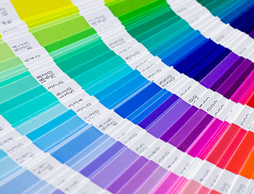
Exterior color is no longer a cosmetic afterthought in commercial design. It’s a strategic decision that shapes perception, reinforces brand identity, and influences how a building performs over time. The shift toward modern commercial building colors reflects a broader move toward intentional, high-impact aesthetics that balance durability with visual clarity. Office buildings today are expected to look sharp, age well, and communicate purpose at a glance.
Why Modern Commercial Building Colors Matter
Color defines how a building is read from the street. In dense commercial zones, where structures compete for attention, modern commercial building colors act as a differentiator. A well-executed palette signals professionalism and stability, while a poorly chosen one can make even a new building feel outdated.
Beyond appearance, color also affects heat absorption, maintenance cycles, and material longevity. Lighter tones can reduce heat gain, while darker accents can highlight architectural features without overwhelming the facade. The goal is not just visual appeal but long-term performance, which is why colors are increasingly selected with both aesthetics and function in mind.
Neutral Foundations with Strategic Contrast
The Rise of Layered Neutrals
Neutral palettes continue to dominate commercial exteriors, but they’ve evolved. Instead of flat whites or basic grays, designers are layering tones (warm taupes, soft charcoals, and muted beiges) to create depth. These combinations are at the core of modern commercial building colors, offering versatility without looking generic.
Layered neutrals allow buildings to maintain a timeless look while still feeling current. They also provide flexibility for branding elements, signage, and future updates without requiring a full repaint.
Contrast as a Design Tool
Contrast is where neutral schemes come alive. Dark window trims, metal accents, or bold entry points create visual hierarchy. This approach is a defining feature of modern commercial building colors, where subtlety meets intentional contrast.
Rather than overwhelming the structure, contrast is used to guide the eye, highlighting entrances, framing glass panels, and breaking up large surfaces. The result is a clean, structured appearance that feels both modern and controlled.
Earth-Toned Palettes for a Grounded Aesthetic
Natural Influence in Commercial Design
Earth tones are gaining traction as businesses look to create environments that feel stable and approachable. Shades like clay, olive, sandstone, and deep brown are becoming key players in modern commercial building colors.
These palettes work particularly well for office parks, healthcare facilities, and professional services where a grounded, trustworthy image matters. They also blend seamlessly with landscaping, reducing visual harshness and creating a cohesive exterior.
Balancing Warmth with Modernity
The challenge with earth tones is avoiding a dated appearance. The solution lies in pairing them with sharper elements: black steel, glass, or cool gray accents. This balance keeps colors aligned with contemporary expectations while still delivering warmth.
Dark Exteriors with Minimalist Appeal
The Shift Toward Bold Simplicity
Dark exteriors are no longer reserved for niche designs. Deep charcoals, matte blacks, and rich navy tones are now central to modern commercial building colors, especially in urban environments.
These palettes create a striking, minimalist aesthetic that communicates confidence and sophistication. When paired with reflective glass or metallic finishes, dark exteriors can elevate even simple structures into high-end commercial spaces.
Managing Longevity and Maintenance
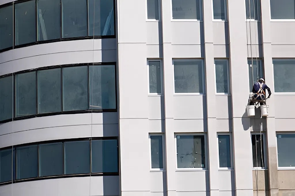
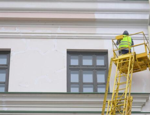
While dark colors make a strong visual statement, they require precise application and high-quality coatings to maintain their finish. Fading, chalking, and heat absorption must be addressed during product selection. This is why the successful implementation of modern commercial building colors in darker palettes depends heavily on professional execution and material choice.
Monochromatic Schemes with Subtle Variation
Controlled Simplicity
Monochromatic designs are a hallmark of modern commercial building colors, offering a clean and cohesive look. Instead of multiple contrasting hues, these schemes rely on variations within a single color family.
For example, a building might use three shades of gray: one for the main facade, one for accents, and one for trim. This creates visual interest without disrupting the overall harmony.
Architectural Emphasis
Monochromatic palettes shift the focus from color to structure. Lines, shapes, and materials become more prominent, allowing the architecture itself to stand out. This approach is particularly effective for contemporary office buildings where design precision is a priority.
Incorporating Brand Identity into Exterior Colors
Color as a Branding Extension
Office buildings are increasingly being designed with brand alignment in mind. Modern commercial building colors often incorporate subtle references to a company’s identity, whether through accent panels, entryways, or signage integration.
The key is restraint. Instead of overt branding, colors are woven into the design in a way that feels intentional and professional. This ensures the building remains visually appealing even if tenants change.
Flexibility for Multi-Tenant Spaces
For multi-tenant office buildings, neutrality remains essential. However, strategic accent zones allow individual businesses to personalize their space without disrupting the overall design. This balance is a defining characteristic of modern commercial building colors, where adaptability is built into the aesthetic.
Performance-Driven Color Selection
Climate and Material Considerations
Color selection isn’t just about trends; it’s about performance. In warmer climates, lighter modern commercial building colors help reduce cooling costs, while in cooler regions, darker tones can contribute to heat retention.
Material compatibility also plays a role. Different surfaces (stucco, metal, concrete) interact with paint differently, affecting how colors appear and age. A successful exterior scheme accounts for these variables from the start.
Durability and Maintenance Cycles
Commercial properties demand longevity. High-traffic areas, exposure to pollutants, and weather conditions all impact how colors hold up over time. Choosing the right coatings and finishes ensures that modern commercial building colors maintain their integrity, reducing the need for frequent repainting.
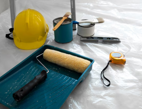
As emphasized in industry best practices, achieving lasting results requires more than just selecting the right palette. It involves proper preparation, skilled application, and an understanding of how structures are built and maintained; factors that directly influence the success of any exterior upgrade.
Choose Socium Coatings: Trusted Experts for Commercial Painting Services in Atlanta, GA
When it comes to executing modern commercial building colors with precision, experience is what separates a decent result from a standout one. Socium Coatings brings a disciplined, performance-first approach to every project; combining surface expertise, premium materials, and a clear understanding of how commercial properties in Atlanta need to perform under real conditions.
Get in touch with Socium Coatings today to discuss your project and turn your vision into a finish that actually holds up.

Leave A Comment